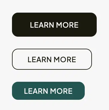
This widget functions as an equivalent to the standard button widget in Elementor, but with pre-configured theme-based styles. Potentially, you could achieve a similar look using the standard button widget, but our widget ensures maximum compatibility and smooth integration with our theme’s design. Here are its settings:
- Button Style: choose a pre-defined style that matches your theme.
- Button Size: select the default or a specific size for your button.
- Hover Style: set the style when the button is hovered over, such as a fill effect.
- Button Text: enter the text that will appear on the button.
- Button Link: provide the URL for the button’s action.
- Target Type: decide if the link will open in the same window (
_self) or in a new one (_blank).


